It is super late and I should be sleeping but I’m really proud of this little doodle! I love using micron pens to create little details and I am starting to unlock their full potential!

It is super late and I should be sleeping but I’m really proud of this little doodle! I love using micron pens to create little details and I am starting to unlock their full potential!

Today I finished my first attempt at a portrait. I used a photo of myself from prom as a reference. It was a difficult drawing to do, even with it being a profile. I used both colored pencils and acrylic paint to complete this drawing. This is quite a rough starting point but I hope to improve with a bit more practice!

For this drawing I created another mandala design using both a compass and a micron pen with a width of .35mm. I then used markers with water-based ink to color in my mandala, giving it a bright and vibrant look. I wish that I had used lighter colors on the outer two layers bc the dark purple and red shades look muddled together and you can hardly see the stripes on the purple layer. I had a great time drawing this, and I will definitely continue to make mandalas in the future! With that being said, I think I will start to focus on drawing facial features now, because I am ready for that challenge! I think drawing a portrait would be incredibly difficult, so I would like to practice a bit before I give that a go!

I am currently sick, so this was a perfect time to try out a drawing! I wanted to created a detailed mandala design, so my mom picked me up some micron pens from Michaels craft store. For this piece, I used pens of .25mm, .35mm, and .45mm width. Micron pens are really nice because they don’t smudge and the nibs don’t fray. They are also relatively inexpensive, the package of three pens my mom picked up were about $10. I chose to use all black so that it would have a uniform look, and so the different detailed layers would really stand out. I used a compass to create the first circles, and then outlined the pencil lines in pen. I didn’t use a reference at all for this drawing. This isn’t perfect at all, and in future drawings I want to make the lines more crisp; however, I am still happy with it.

Today I decided to try something a little different and create a drawing without using any sort of reference. I drew flowers again because I think they are very pretty and fun to draw. I used different graphite shades and different shading techniques to complete this drawing. I also used a blending stump to make each petal fade smoothly from light to dark. I did not blend the stem or leaves, because I thought the difference in pencil strokes looked nice. I then used graphite dust and a tissue to give the empty parts of the paper an ashy look. I am quite happy with how this piece turned out!

It is currently the night before prom but I am working on a simple eye sketch that I felt was good enough for a blog post! This is my first graphite drawing and it was a lot of fun! I have always struggled to draw any sort of human features, so this eye was quite the challenge. I looked up some reference pictures to see how to shade it properly and sketch the right shape. I had to sketch many other eyes before I was able to complete this one. This was the best looking one by far and I’m pretty happy with how it turned out! I definitely want to keep experimenting with human features. I used various shades of Faber Castle graphite pencils (shown next to the drawing) to complete this piece.
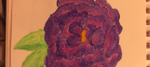
This is a simple purple flower that is similar to a drawing a previously did. This time, I used a blending stump to even out the colors and make it smoother. When you blend pastels, and are heavy handed like me, your drawing will often have a rough texture. I really liked utilizing the blending stump because it made my drawing look a lot better. I did this drawing on a mother’s day card for my mom, and she said it looked very nice. I am proud of the progress I have made so far. It is obviously unrealistic to expect to have great artistic skills in only a few months, but I am having such a fun time learning! I hope to continue this blog, because I want to catalog my progress for years to come.
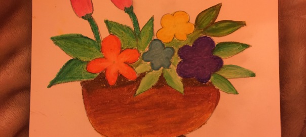
This drawing is of a flower pot. I used a tutorial from Youtube for this drawing. I really love the different vibrant colors, however once again my drawing isn’t as detailed as the one in the tutorial. I feel that I am a bit heavy handed with the pastels, which I will hopefully be able to improve upon the more I practice. Despite this I am still pretty happy with this drawing and I hope to continue with the pastels!

This is a flower drawing that I used the tutorial “Easy Oil Pastel Flower-Time Lapse” on Youtube to create. The tutorial itself served more as inspiration than instruction for this drawing because it was just a time lapse video of someone drawing a flower. Their drawing was much more detailed than mine, but I am quite happy with the way this turned out. I really love how vibrant the pastels are and I am eager to create more with them!

Today I went to purchase some more pastels because the first set I bought had only 12 colors, and to do anything more complex a broader color range would be necessary. I went to the Hobby Lobby store and found this great set of 50 pastels that was one sale for 6 dollars. The price was great and they had an awesome range of colors so I decided on that. I haven’t been buying and expensive art supplies because I am just learning so I don’t feel that’s necessary. I tried them out at home and I am quite impressed with how vibrant they are. These are oil pastels, I will be working with soft pastels at a later date.
